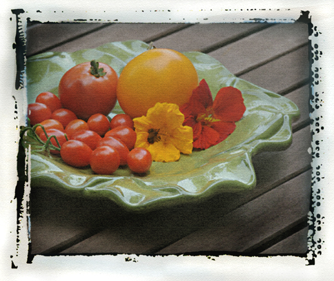
Here’s my second attempt at a Polaroid transfer created digitally. After reading Scott’s comment, I agree that the instructions to use a watercolor paper texture (from a digital photo of the paper) added a bit too much texture, so I used Photoshop to achieve a more linen-like texture. And Scott’s right about the fading, but initially I was always able to get pretty intense colors in my transfers. They do fade, so if you intend to give the images away or sell them, I advise creating high resolution scans on your flatbed scanner (at original size, RGB, 300 dpi), then printing on archival matte paper (or even watercolor-textured archival inkjet paper) to duplicate the texture of the original transfer. This will ensure that they won’t fade. I find that when the original do fade, they tend to go to a bit more blue cast. I think one of the things that is off with the transfer below is that there isn’t enough blue in the “residue” around the image. I did look at some of my originals and not all of them have that tell-tale inky blue cast in the residue, though. And the other thing missing are flawed areas (when the print doesn’t lift well in some areas, it tears away the emulsion and you’ll get “hot spots” in the print. That doesn’t always happen, but it’s pretty common. I like mine with as few hot spots as possible, hence why I went through so much Polaroid film in creating those images in the last post!
© Cindy Dyer. All rights reserved.

The vegetables are pretty but how about some chocolate!